
How I joined Wahed as a UX Designer...
I thought it might be interesting for some to learn about how I got a UX Design role at Wahed, so here we go.
Let's paint the picture: I was working at my previous company for around 2 years. With it being my first real taste of working solely as a UX Designer (having previously worked on UI), I gained a lot of valuable knowledge and experience.
I knew around this time that it was time to go. The role was stagnant, and I did not see a possible way to progress within the company - much like Van Persie at Arsenal, things needed changing...
I first noticed Wahed while probably on the 15th page of UX Designer roles in the LinkedIn job section. Intrigued to know more, I navigated to their website and opened up many Google tabs to find out more about the Islamic investing company.
By the time I got to the bottom of the homepage, I was sold on the idea - not because of what they were showing in terms of products or design (aha, I'm well aware that the website needs some love) - it was the fact that I was sold on the vision.
I thought the idea of working on something that could benefit Muslims around the globe was something that I was (and still am!) passionate about. With me being somewhat prepared, I was able to send off my CV and portfolio with very few changes, and then I put it to the back of my head and continued about my week as usual.
About a week goes by, and I get a message from the hiring manager (my current boss) asking when I'm available for a first-stage interview. I replied almost instantly and reopened all those closed tabs and got back to research - some of which included finding out more about who the interviewer was.
The interview goes as smoothly as I could've hoped for, and my assumption was correct, as I received the design task below the following week.
The problem: - Users are not making deposits into their investment accounts. In the last quarter, the number of deposits into users’ investment portfolios has dropped by 10%.
Task:
1. How would you identify the root cause of the problem?
2. How can you improve the current deposit flow to increase the number of deposits?
Having some preconceived ideas as to what the problems were, I wanted a way to validate these hypotheses. How might one do that? Through UX research. The first thing which came to my mind was conducting a competitor audit. I must've downloaded a variety of apps on my phone including primary competitors (Robo Advisory platforms) such as Nutmeg and secondary competitors (mainly neo banks) such as Revolut, Monzo and Starling.
After sifting through the good, the bad, and the ugly, I was able to identify how other companies encourage their users to deposit money and the various ways in which they do so. It was then time to switch my attention to Wahed and the task at hand. Having been on a deadline I needed lots of information, quickly! Which is why, I conducted a usability test on my family and friends, which required them to download the Wahed app to test the current flow and give feedback based on their experience.
The usability test was unmoderated, one of the reasons I opted for this approach was that I didn't want to influence the test in any way (which removed any sort of bias I may have had). After completing the test, I had them fill out a survey which helped me collate the data in a digestible format, splitting both the quantitative and qualitative answers nicely.
The quantitative data was nice to see as a breakdown and made my life easier when I compiled a presentation for this whole task. As for the qualitative answers, I was able to create a mindmap from them. Being able to section out people's thoughts as well as my own, was nice to visualise and helped as I drafted designs to solve the issue.
Lastly, to wrap up the research front, I created personas to help empathise with Wahed users and figure out what they wanted to achieve by using the app, and as a result, I uncovered extra pain points. As far as I was concerned, that was task 1 complete.
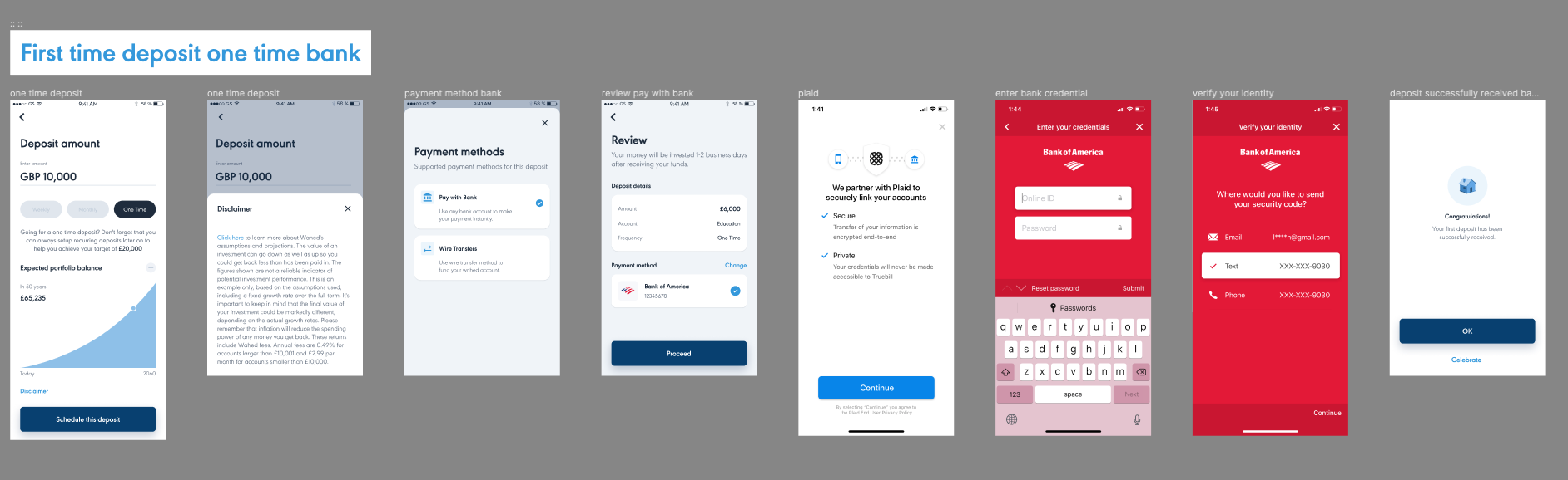
I then turned my attention to task 2, which was focused on designing a solution to the problem. I was lucky enough to be given the current deposit flow (Figure 1) as a screenshot, which was attached alongside the task within the email. I used this as a reference for when I started the designing phase.
Now I know some UX designers reading this would jump straight to Figma, and that's what the younger generation call a RED FLAG 🚩! I'm here to instill good UX practices into my readers. Which is why I'll tell you one reason for why we don't, it's because not only do you not know what to include, you actually spend more time interacting on the designs compared to someone who drew wireframes and scaled it up.
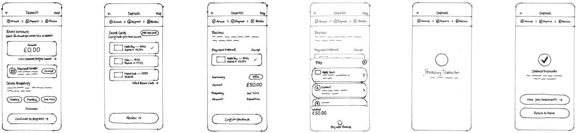
So I tackled this problem as I would any design problem - by starting with a Crazy 8. An exercise, whereby you draw 8 wireframes in 8 minutes to identify possible solutions. Now that's not to say I generate the whole design in that 8 minutes but it did give me a good head start. In terms of getting inspiration on any design work that you do, is a challenge in itself, there are many avenues which can help get you thinking more freely (it's something I'll probably write a blog post about soon). The majority of my best ideas come whilst I'm about to go to sleep. The reason behind this, I believe, is because I'm away from my screen and I can think about the problem with a clear head.
Anyways I digress, using the information I collected in task 1, I was able to identify the problems which caused the number of deposits into users’ investment portfolios to drop by 10%. Here are some of the reasons:
- The market could've played a part, if the market was bad it could've explained a drop in investments. This factor was out of my control, so I didn't focus much attention on it, but I made sure to highlight it within the presentation I created later
- There was no nudge for users to deposit money into their investment accounts
- Another thing to note which could've reduced deposits was that the "Select frequency" of payment tab was preselected (I've brought this issue up since being hired, the plan is to change it moving forward) which seems bizarre, as users may accidentally select a recurring deposit without meaning to. Which could explain why a certain % of users were reluctant to deposit any more.
- Lastly, I noticed the user journey was not as seamless as users would've hoped for so
From the list above, I had what I thought was the solution.
So I put these issues to the forefront when creating the wireframes. Prior to getting my iPad, I used to draw all my wireframes on paper. It made it easy to iterate on designs and wasn't time consuming. Wahed provided me with a simplified version of their design system (as the official isn't made public) and I was able to reuse certain components throughout the design process. Once I had iterated and was happy with the designs I had created, I then scanned and imported these paper wireframes into Figma (Figure 2).
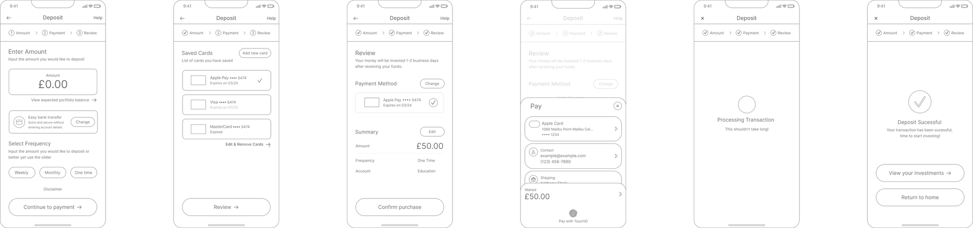
The next step was to replicate these designs in the form of Low-fidelity (Lo-fi) mockups. The wireframes were so accurate which made my life easier when creating the Lo-Fi within Figma, I must've spent less than an hour replicating the designs. The reason behind creating Lo-Fi's is that it allows you to test your designs through a usability test without fully committing to the designs.
Having created the Lo-fi's, I then tested the solution by linking all the screens via the prototyping and conducting a moderate usability test with my friends and family. I then spent some time ironing out any potential problems with the designs I had created.
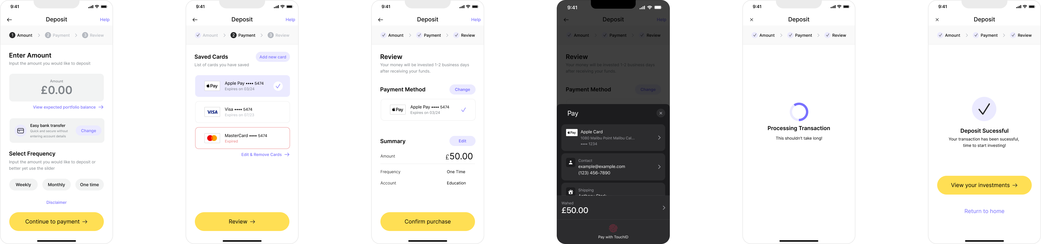
I then got to work creating the high-fidelity (Hi-fi) mockup screens, which were in line with the design system provided to me. The design system provided colours and components which allowed me to create the Hi-fi's a lot quicker. So instead of creating new colours as well as components I could copy some of the main ones, for example, the input amount and paste it into my designs effortlessly.
Once I was happy with how the screens looked (Figure 4), I conducted another usability test with my friends and family.
I then got to work sorting out my Figma file (a tedious task, but one that needed doing nevertheless). Below, you can view how I organised my file.
Figma File Format
Page 1: Cover - Showed a nice thumbnail for the project
Designs
Page 2: Hi-Fi - Showed the solution screens
Page 3: User Flows - Showed the user flow of the screens and how the user would navigate it
Page 4: Red Lines - A page showing the screens with the red lines plugin which shows the dimensions of each element (A plugin which can be of much use to a developer)
Page 5: Lo-Fi - Low fidelity screens
Page 6: Wireframes - Paper sketches of the solution
Research
Page 7: Competitive Audit - Comparing the pros and cons of 2 competitors
Page 8: Affinity Map - Grouping ideas to help digest large pieces of information
Page 9: User Journey - Understanding the user's journey throughout and identifying key improvements
Page 10: Pain Points - Discovered the user's wants/needs
Page 11: Personas - Created personas to help get into the mind of a typical user of the application
I then got to work creating a presentation to showcase my work in a digestible way, which identified the problem, the process of finding the solution and then presenting the solution.
Having concluded the presentation, it was time to say goodbye to all my hard work. I attached both a link to my Figma file and the presentation and awaited a response.
After roughly a week of biting my nails (I don't do that for the record; it's gross), I'm tucked up in bed on my phone, getting ready to call it a day, and I hear a bing sound coming from my phone. Normally, I wouldn't check my email at 2 am, but I happened to see from the notification that it was from the hiring manager.
A bit of me was thinking it might be bad news, and I should probably open it in the morning so that I can sleep in peace 😂. However, on the contrary, I wouldn't be able to sleep without knowing if I got the job. So at this point, I resigned myself to the fact that I'm either going to sleep buzzin' or not sleeping at all, pondering where it all went wrong.
I clicked on the email and saw this...
"Salaam Rehan,
I really enjoyed our conversations and believe that you are a great fit for the product designer role at Wahed. Therefore I would love to offer you the Product designer role."
Safe to say I went to sleep on a high hahaha. And now, here I am, as happy as can be at Wahed, doing what I love.